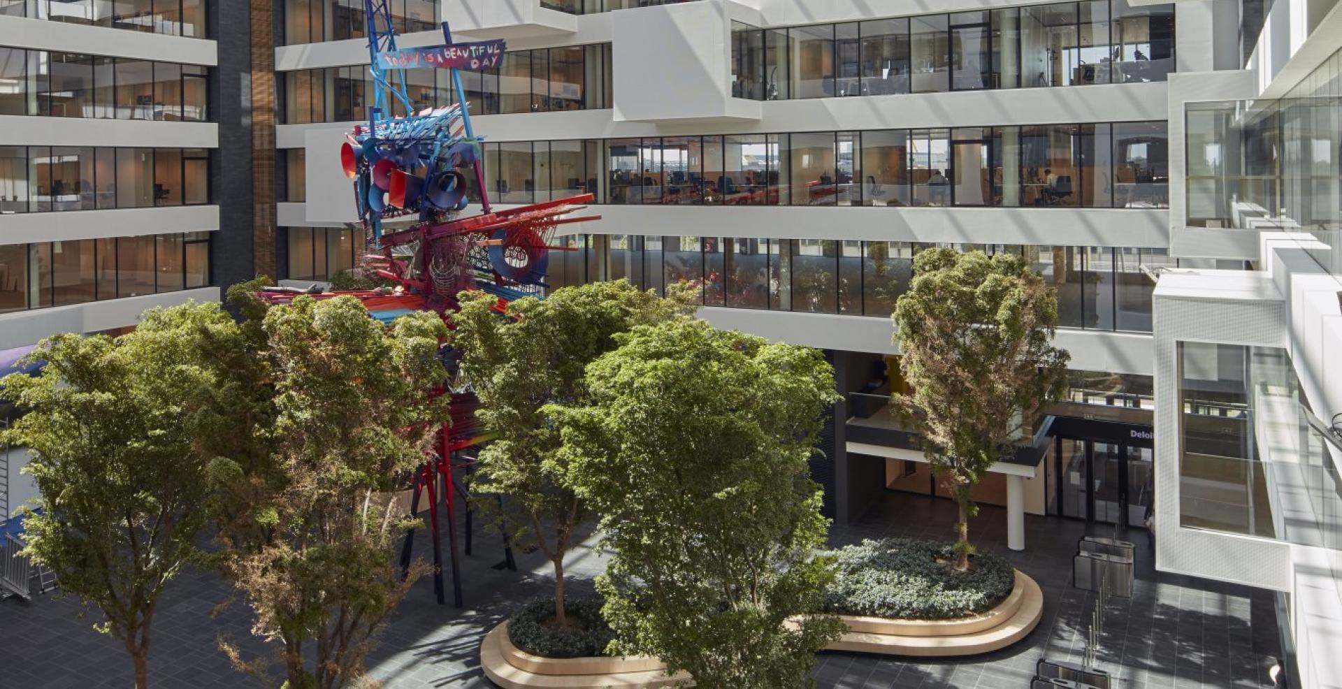
Internship at Deloitte
Energy Consumption Insights
During my internship, I developed an interactive Power BI dashboard for Deloitte Belgium’s Facility team, providing a clear overview of energy, gas, and water consumption across all office locations. To support this, I designed a robust and future-proof data pipeline that automatically collects consumption data via APIs and scraping scripts. Additionally, I created predictive models that use historical data, location, time, and weather factors to forecast future usage patterns and trends.
The question:
The Facility team at Deloitte Belgium needed a renewed and user-friendly dashboard to visualize the energy, gas, and water consumption of all offices. They wanted a solution that would allow them to analyze and filter usage by office location and time period, to better understand consumption patterns and trends. Additionally, they wanted to be able to forecast usage and analyze the impact of weather conditions on consumption.
Moreover, the current method of data collection was problematic. Consumption data was gathered using scripts that scraped data from website front-ends, which was error-prone and vulnerable to changes in website structure. Therefore, this approach needed to be replaced by a future-proof solution based on APIs and backend integrations.
There was also a strategic objective: the existing dashboard was built in Qlik Sense, but the team wanted to transition to the Microsoft ecosystem using Microsoft Fabric and Power BI, in order to benefit from more modern and integrated tools.
My solution:
To meet these needs, I developed a completely renewed Energy Consumption Dashboard within Microsoft Fabric and Power BI. I addressed three key pillars:
- Modernizing data collection
I replaced all outdated scraping scripts with reliable API connections that fetch the data automatically and without errors. This makes data collection much more stable and future-proof. I also automated the processing of CO₂ conversion factors, synthetic load profiles, and weather data, so the dashboard also provides insight into environmental performance.
- Dashboard development
The dashboard offers an interactive and intuitive user experience. Users can easily filter by office locations and time periods, allowing them to quickly identify consumption patterns and trends. The visualizations have been refreshed and are clearer than before, enabling the Facility team to effectively analyze the data.
- Forecasts and analyses
I applied statistical models to forecast future energy consumption, taking into account historical data and weather influences. This enables Deloitte to budget more effectively and support its sustainability goals.
The end result is a powerful dashboard that not only meets the current needs of the Facility team, but also lays a solid foundation for future expansion and use within the broader Data & Analytics team. Additionally, the dashboard was validated by comparing its data to official reports and environmental audits, ensuring reliability and accuracy.
The Team:
During my internship, I worked within Deloitte's Enabling Functions department, which supports internal projects. Specifically, I was part of the Data & Analytics team, a group of about five permanent staff members. Their focus is on turning data into valuable insights to enable internal departments to make data-driven decisions. They work on extracting, transforming, and visualizing data, often in the form of dashboards.
My internship project was commissioned by the Facility team of Deloitte Belgium. This team is responsible for managing the work environment, including office infrastructure, logistics, safety, and sustainability.
Documents:
Due to confidentiality, I cannot share screenshots of the dashboard. All sensitive information has been removed from my documents.